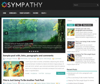
Sympathy is a Clean, Responsive, 2 Columns Blogger Template created for General/Blog sites. Sympathy Blogger Template Support for Mobile Devices and has a Slider, 2 Top Navigation Menus, Social Buttons, Header Search Box, Related Posts with Thumbnails, Breadcrumb, 3 Columns Footer, Tabbed Widget, Google Fonts and More Features.
|
Template name : Sympathy
Template type : 1 Sidebar, 2 Column, 3 Column footer, Adapted from WordPress, Black, Blue, Breadcrumb, Elegant, Featured Section, Fixed width, Responsive, Fresh, Magazine, Premium, Related Posts, Right Sidebar, Slider, Tabbed widget, Top Navigation Bar, Web 2.0, White Release date : June 12, 2015 Author Name and URL : Lasantha Bandara / http://www.premiumbloggertemplates.com/ Original Designer URL : https://flexithemes.com/sympathy-wordpress-theme/ Basic Instructions : How to install a Blogger template Advanced Details : http://www.premiumbloggertemplates.com/sympathy-blogger-template/ |
How to Configure Sympathy Blogger Template
Read instructions given below to configure Sympathy Blogger Template.
You need to use 615px width and 300px height size images for the slider.
Best maximum size for a header logo will be 576px width and 60px height.
Main column area width is 615px and Sidebar width is 300px.
The Sympathy is responsive, so disable default mobile blogger template option after installing this.
How To Configure Featured Content Slider
