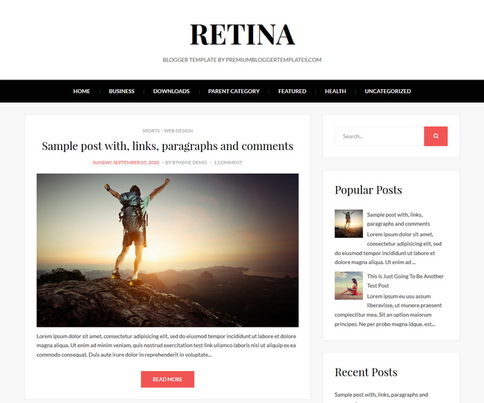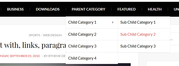
Retina is a clean and miniaml, 2 columns Blogger Template ideal for personal blogs. It is fully responsive to make sure a consistent experience on various devices and resolutions. Retina Blogger Template has a a dropdown menu, related posts with thumbnails, social and share buttons, right sidebar, Google fonts, auto post summaries and more features.
|
Template name : Retina
Template type : 1 Sidebar, 2 Columns, Adapted from WordPress, Responsive, jQuery Included, CSS3, HTML5, Magazine, Minimalist, Mobile Friendly, Photoblog, Pink, Related Posts with Thumbnails, Right Sidebar, Share Buttons, Social Buttons, Top Navigation Menu, Web 2.0, White Release date : January 26, 2017 Author Name and URL : Lasantha Bandara / http://www.premiumbloggertemplates.com/ Original Designer URL : http://fthemes.com/shoppingtime-free-wordpress-theme/ Basic Instructions : How to install a Blogger template Advanced Details : http://www.premiumbloggertemplates.com/retina-blogger-template/ |
Read instructions given below to configure Retina Blogger Template.
How To Add Links to Top Navigation Menu

Find this in "Edit HTML":
<div class='site-primary-menunbt'>
<ul class='primary-menunbt sf-menu'>

<li><a expr:href='data:blog.homepageUrl'>Home</a></li>

<li class='page_item_has_children'><a href='#'>Business</a>
<ul class='sub-menu'>
<li><a href='#'>Internet</a></li>
<li><a href='#'>Market</a></li>
<li><a href='#'>Stock</a></li>
</ul>
</li>

...

</ul>
</div>
Replace "#" marks with real URLs and change anchor texts as you like.
How To Configure Social Buttons
Find this in "Edit HTML":
<div class='social-buttons-area'>
<a href='https://twitter.com/' rel='nofollow' target='_blank' title='Twitter'><i class='fa fa-twitter'/></a>
<a href='https://www.facebook.com/' rel='nofollow' target='_blank' title='Facebook'><i class='fa fa-facebook'/></a>
<a href='https://plus.google.com/' rel='nofollow' target='_blank' title='GooglePlus'><i class='fa fa-google-plus'/></a>
...
</div>
Change default social links with your social profile URLs.
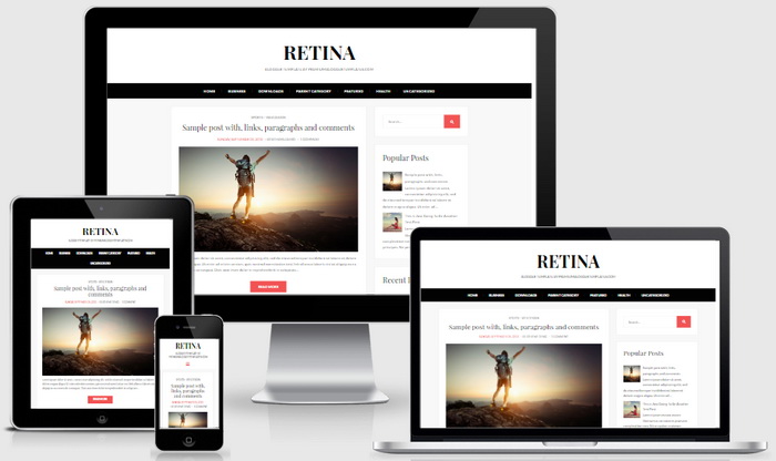
This is how it looks on different devices:

It is 100% responsive and looks great on desktops and mobiles devices like iPhones, iPad, or other smartphones and tablet.
